1.
|
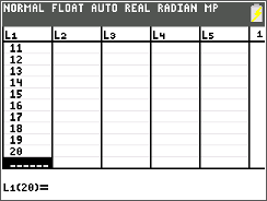
Box plots are really annoying diagrams to draw. They require an awful lot of ruler work and drawing pencil lines. However, lucky for us, there is a way to draw one of these on your graphing calculator. The first thing that you want to do is to enter all of the results that you have to calculate the box plot with into a table exactly like the one that we used in the "Entering a Table of Results" tutorial.
|
|
2.
|
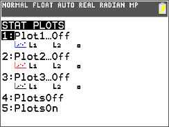
Now in order for us to graph anything that has any statistical application, we have to make sure that the functions on our calculator that allow us to do this are turned on. We do this by pressing the '2ND' button and then pressing the 'Y=' button. This will bring up the screen shown to the right (or below if you are looking at this website on a mobile device).
|
|
3.
|
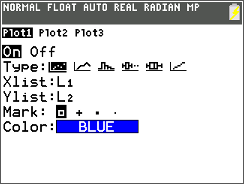
The next thing that you want to do is press 'ENTER' on the 1st option on the screen shown above. It should be the option that is selected by default. Then, on the screen shown to the right, you want to make sure that you select the 'On' option by pressing the 'ENTER' key with your calculator's cursor blinking over the 'On' option and also you will want to make sure that the box plot option is selected by moving your calculator's cursor over to the box plot graphic and pressing 'ENTER' with the cursor blinking over it. Both of these actions are shown on the screens to the right (or below if you are looking at this website on a mobile device).
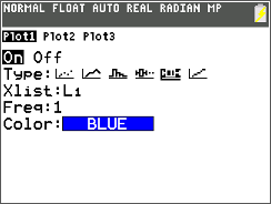
Furthermore, you should also note that when you select the box plot option, the screen slightly changes to rather than having the 'Xlist', 'Ylist', 'Mark' and 'Color' options, it will have the 'Xlist', 'Freq' and 'Color' options. The 'Xlist' is the list that we set up at the beginning of the tutorial, you should make sure that the list number that you entered your results into is the same one that is set up as the 'Xlist'. If it is not, all you have to do is press the '2ND' button and then press either the '1' (L1), '2' (L2), '3' (L3), '4' (L4), '5' (L5), or '6' (L6) keys, depending on which list you entered the data into. Furthermore, the 'Freq' option is the scale that the 'X' axis will be measured by on your box plot, as you can see, for us, my scale on my 'X' axis is 1. |
|
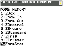
4.
|
Next, press the 'ZOOM' key. Navigate down to and select the 'ZoomStat' option by pressing the 'ENTER' button, shown in the image to the right (or below if you are looking at this website on a mobile device).
|
|
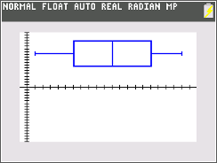
5.
|
Finally, we see our box plot drawn on a graph. We should note that we can ignore the 'Y' axis as the entire basis of a box plot is based off of the 'X' axis.
|
|
